Overview
Design review or issue templates are pre-filled frameworks and content that you can set in advance for any future reviews.
They are great to:
- Standardize processes across teams
- Give new engineers a starting point to help with their training and onboarding
- Avoid repetitive manual tasks of entering the same information for each new review
- Reduce the risk of manual and items slipping through the cracks
Options
- Default single design review (pull request) template
- Multiple design review templates
- Issue Templates
- Markdown template syntax
- Yml template syntax
Single design review (pull request) template
This template is perfect if you need only one template type.
 Steps to create a design review template in Allspice Hub
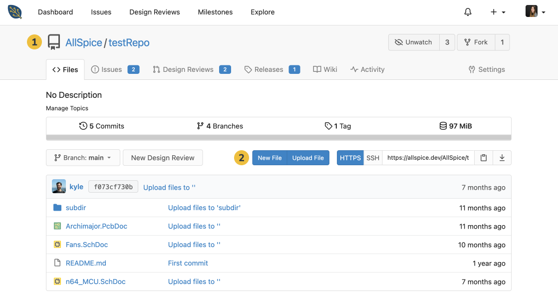
1. Navigate to the repository where you'd like to create the review template
2. In the Files tab, select New File
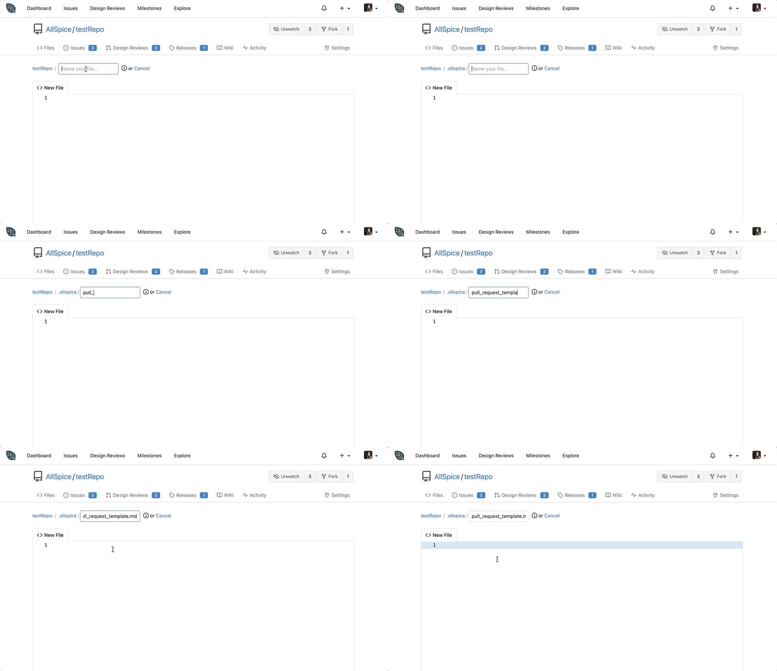
3. Create a directory called .allspice
- Note: You can skip this step if you put the template in the root directory
4. Create a file called pull_request_template.md
- Note: AllSpice Hub calls the template using this name, so make sure it's entered properly
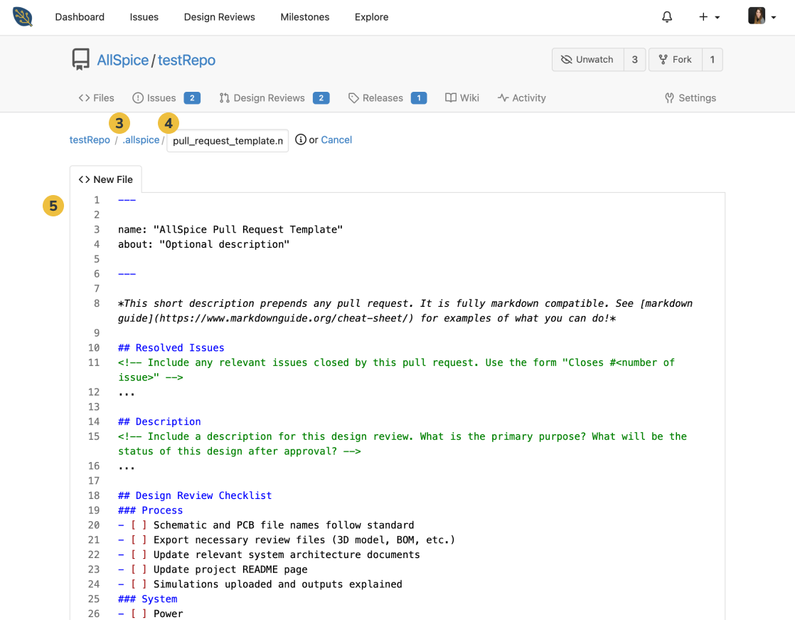
5. Enter your template contents in the New File section using Markdown styling
- For a text version of a checklist you can use (to copy and paste) for your own template, click 'Raw' in AllSpice's design review template
- Check out the Markdown Cheat Sheet for the basics to format your template
6. Once your template is ready, click Commit Changes at the end
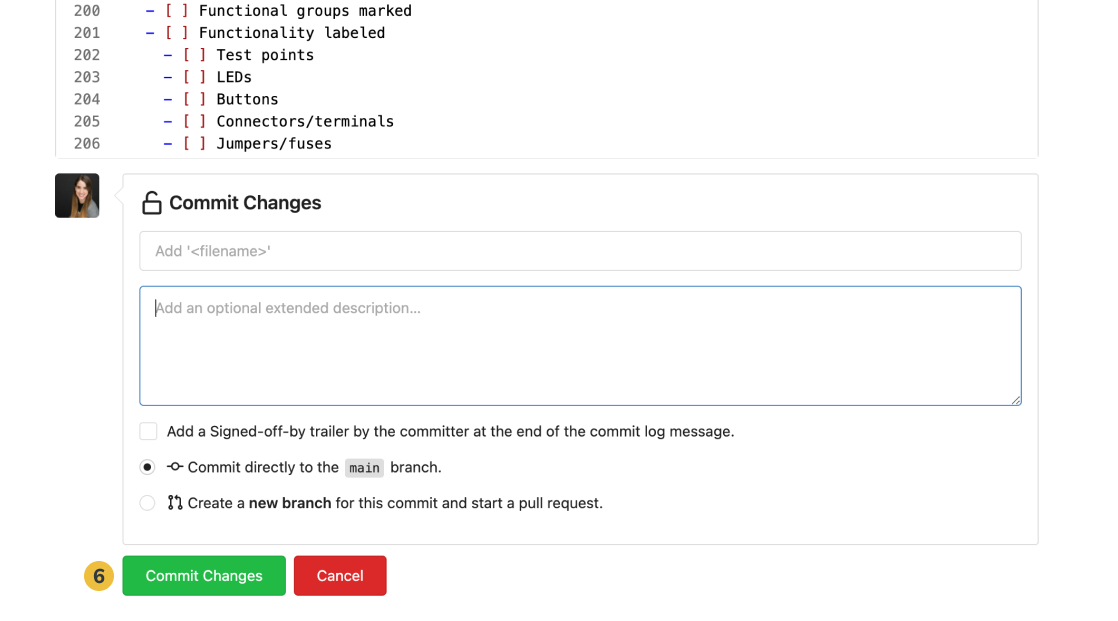
Using your design review template
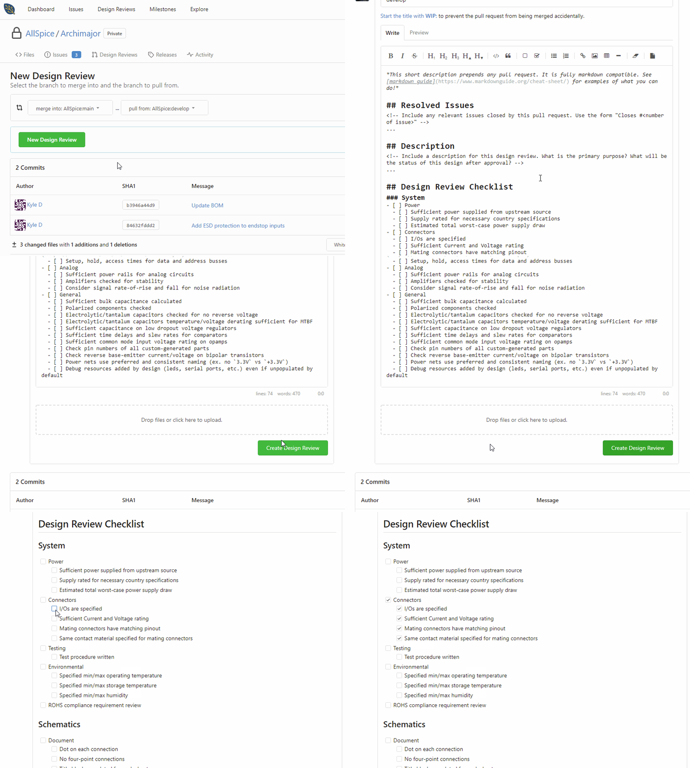
Going forward, the contents of your template will automatically populate for any new design reviews.
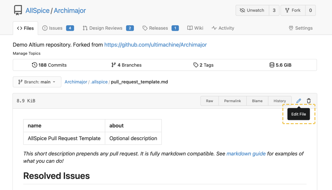
You can edit your review template by navigating to the file location and selecting Edit File
Multiple design review (pull request) templates
You may want to use different templates for different phases of the design process, like templates for sch, pcb, BOM, gerber review.
The interface for multiple templates requires manually adding a query string to the URL, so it may not be the best solution for you.
If you do want to use multiple design review templates, this is how you do it.
Adding multiple pull request templates
Create a folder in your repo called "pull_request_template". You might be able to change the name in the future, but for now it should be this exact folder name.
Inside the folder, add your individual template files. These can be markdown or yml.
Using the multiple pull request templates
By default, the system will load the default pull request at .allspice/pull_request_template.md
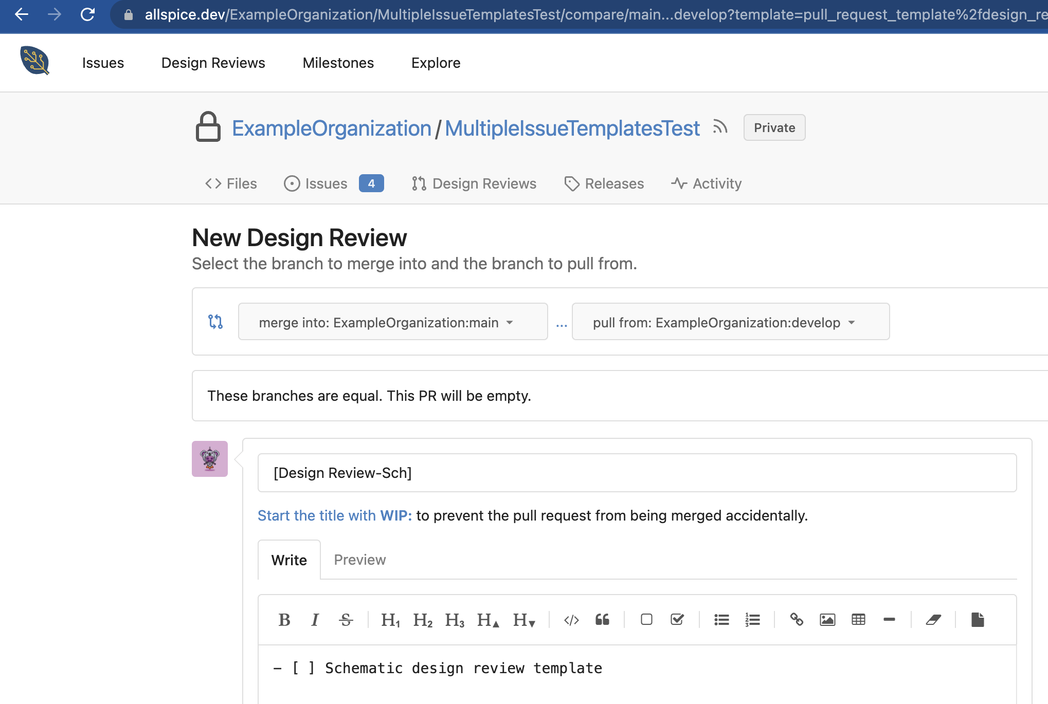
If you want to load one of your multiple pull requests, you add the following query string to your design review when you create it:
?template=pull_request_template%2fnew_template.ymlHere is the full URL
https://hub.allspice.io/ExampleOrganization/MultipleIssueTemplatesTest/compare/main...develop?template=pull_request_template%2fnew_template.ymlMultiple Issue Templates
Using multiple issue templates is much easier, as we have deployed a front end GUI interface for selecting the issue template.
Creating issue templates
Create a folder in your repo root directory called "issue_template".
Add your issue template files. These can be in markdown or yml.
Using your multiple issue templates
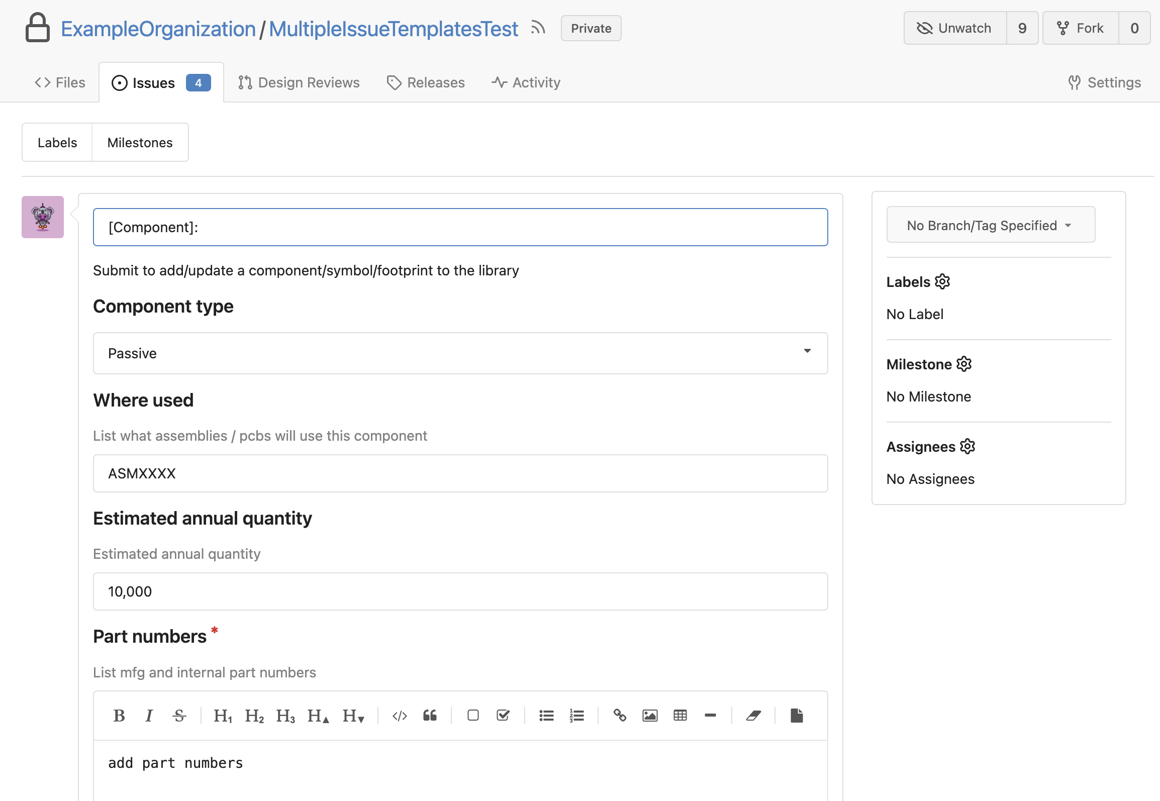
Simply navigate to your repo issue tab and click New Issue. You will be presented with a list of templates to choose from.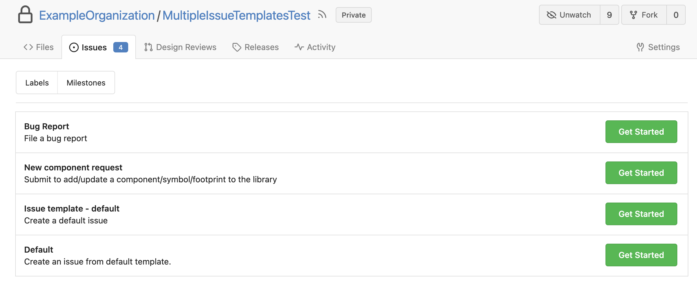 Here is an example of a new component request template.
Syntax for markdown template
In the above example, when a user is presented with the list of issues they can submit, this would show as Template Name with the description This template is for testing!. When submitting an issue with the above example, the issue title would be pre-populated with [TEST] while the issue body would be pre-populated with This is the template!. The issue would also be assigned two labels, bug and help needed, and the issue will have a reference to main.
Syntax for yaml template
This example YAML configuration file defines an issue form using several inputs to report a bug.
name: Bug Report
about: File a bug report
title: "[Bug]: "
body:
  - type: markdown
    attributes:
      value: |
        Thanks for taking the time to fill out this bug report!
  - type: input
    id: contact
    attributes:
      label: Contact Details
      description: How can we get in touch with you if we need more info?
      placeholder: ex. email@example.com
    validations:
      required: false
  - type: textarea
    id: what-happened
    attributes:
      label: What happened?
      description: Also tell us, what did you expect to happen?
      placeholder: Tell us what you see!
      value: "A bug happened!"
    validations:
      required: true
  - type: dropdown
    id: version
    attributes:
      label: Version
      description: What version of our software are you running?
      options:
        - 1.0.2 (Default)
        - 1.0.3 (Edge)
    validations:
      required: true
  - type: dropdown
    id: browsers
    attributes:
      label: What browsers are you seeing the problem on?
      multiple: true
      options:
        - Firefox
        - Chrome
        - Safari
        - Microsoft Edge
  - type: textarea
    id: logs
    attributes:
      label: Relevant log output
      description: Please copy and paste any relevant log output. This will be automatically formatted into code, so no need for backticks.
      render: shell
  - type: checkboxes
    id: terms
    attributes:
      label: Code of Conduct
      description: By submitting this issue, you agree to follow our [Code of Conduct](https://example.com)
      options:
        - label: I agree to follow this project's Code of Conduct
          required: true
Markdown
You can use a markdown element to display Markdown in your form that provides extra context to the user, but is not submitted.
Attributes:
| Key | Description | Required | Type | Default | Valid values |
|---|---|---|---|---|---|
| value | The text that is rendered. Markdown formatting is supported. | Required | String | - | - |
Textarea
You can use a textarea element to add a multi-line text field to your form. Contributors can also attach files in textarea fields.
Attributes:
| Key | Description | Required | Type | Default | Valid values |
|---|---|---|---|---|---|
| label | A brief description of the expected user input, which is also displayed in the form. | Required | String | - | - |
| description | A description of the text area to provide context or guidance, which is displayed in the form. | Optional | String | Empty String | - |
| placeholder | A semi-opaque placeholder that renders in the text area when empty. | Optional | String | Empty String | - |
| value | Text that is pre-filled in the text area. | Optional | String | - | - |
| render | If a value is provided, submitted text will be formatted into a codeblock. When this key is provided, the text area will not expand for file attachments or Markdown editing. | Optional | String | - | Languages known to Gitea. |
Validations:
| Key | Description | Required | Type | Default | Valid values |
|---|---|---|---|---|---|
| required | Prevents form submission until element is completed. | Optional | Boolean | false | - |
Input
You can use an input element to add a single-line text field to your form.
Attributes:
| Key | Description | Required | Type | Default | Valid values |
|---|---|---|---|---|---|
| label | A brief description of the expected user input, which is also displayed in the form. | Required | String | - | - |
| description | A description of the field to provide context or guidance, which is displayed in the form. | Optional | String | Empty String | - |
| placeholder | A semi-transparent placeholder that renders in the field when empty. | Optional | String | Empty String | - |
| value | Text that is pre-filled in the field. | Optional | String | - | - |
Validations:
| Key | Description | Required | Type | Default | Valid values |
|---|---|---|---|---|---|
| required | Prevents form submission until element is completed. | Optional | Boolean | false | - |
| is_number | Prevents form submission until element is filled with a number. | Optional | Boolean | false | - |
| regex | Prevents form submission until element is filled with a value that match the regular expression. | Optional | String | - | a regular expression |
Dropdown
You can use a dropdown element to add a dropdown menu in your form.
Attributes:
| Key | Description | Required | Type | Default | Valid values |
|---|---|---|---|---|---|
| label | A brief description of the expected user input, which is displayed in the form. | Required | String | - | - |
| description | A description of the dropdown to provide extra context or guidance, which is displayed in the form. | Optional | String | Empty String | - |
| multiple | Determines if the user can select more than one option. | Optional | Boolean | false | - |
| options | An array of options the user can choose from. Cannot be empty and all choices must be distinct. | Required | String array | - | - |
Validations:
| Key | Description | Required | Type | Default | Valid values |
|---|---|---|---|---|---|
| required | Prevents form submission until element is completed. | Optional | Boolean | false | - |
Checkboxes
You can use the checkboxes element to add a set of checkboxes to your form.
Attributes:
| Key | Description | Required | Type | Default | Valid values |
|---|---|---|---|---|---|
| label | A brief description of the expected user input, which is displayed in the form. | Required | String | - | - |
| description | A description of the set of checkboxes, which is displayed in the form. Supports Markdown formatting. | Optional | String | Empty String | - |
| options | An array of checkboxes that the user can select. For syntax, see below. | Required | Array | - | - |
For each value in the options array, you can set the following keys.
| Key | Description | Required | Type | Default | Options |
|---|---|---|---|---|---|
| label | The identifier for the option, which is displayed in the form. Markdown is supported for bold or italic text formatting, and hyperlinks. | Required | String | - | - |
| required | Prevents form submission until element is completed. | Optional | Boolean | false | - |